Plot Overview of the Analysis Software IFTA TrendViewer
The most important plots and groups of plots for visualization
Represents the change of a value over time.
To analyze the exact value of a signal at a time.
Examine the change of a signal in correlation to another signal.
The time axes of the plots are automatically grouped together so that all plots represent the same time range, regardless of whether they have an explicit or an implicit time axis. If required, this grouping can also be changed or dissolved. In addition, the time axis can also be bound to the time cursor and then represents a configurable time window around the time cursor.
More topics : Thermoacoustics | Measurement technology | Signal processing
Plots with an Explicit Time Axis.
Plots Visualizing Values at the Position of the Time Cursor
Plots with an Implicit Time Axis
Plots with an Explicit Time Axis
Looking at the change of a signal over time is one of the most fundamental analyses.
IFTA TrendViewer offers two plots for this purpose:
- Trend Plot: Displays scalar and Boolean/logical signals over time. Even signals with different time resolution can be displayed in one plot.
- Intensity Plot: Displays spectra as spectrogram. In addition, signals with the same unit over time can also be displayed.
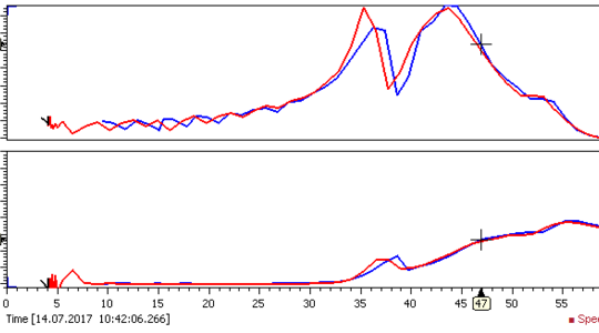
Trend Plot
Use the trend plot to analyze value changes over time. The time is plotted on the x-axis and the values are plotted on the y-axis.
Visualize how a signal changes over time in trend plots. Find dependencies in your data by adding multiple signals to the plot.
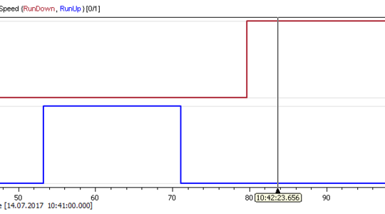
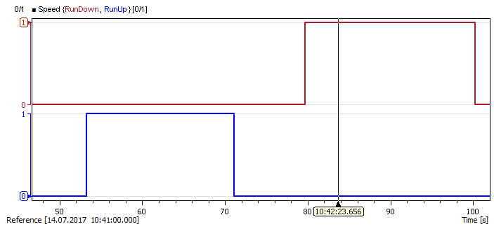
Boolean Trend Plot
Use the Trend plot to analyze value changes over time. The time is plotted on the x-axis and the values are plotted on the y-axis.
Analyze boolean/logic signals over time and identify points in time at which changes take place. Signals are automatically stacked and grouped to one y-axis for better readability.
In the example run-up and run-down signals of a rotating machine are displayed. On the x-axis time is shown and on the y-axis the state (0 for false and 1 for true). As you can see first the machine is in run up state and after a short amount of time it is run down.
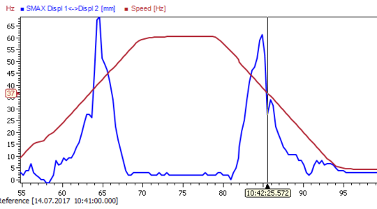
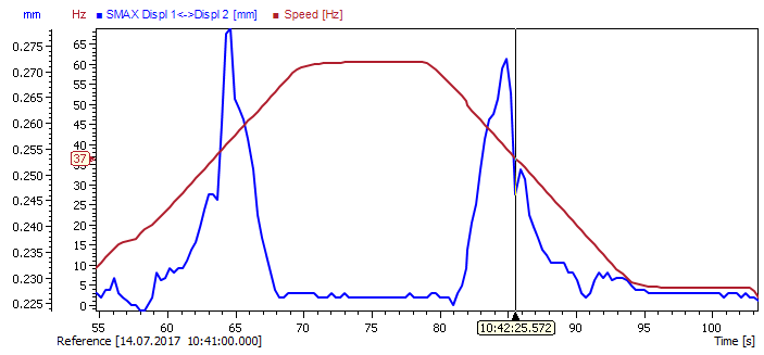
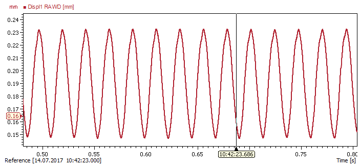
Waveform Trend Plot
Use the Trend plot to analyze value changes over time. The time is plotted on the x-axis and the values are plotted on the y-axis.
Analyze waveforms to see how the amplitudes and waveforms change over time.
The example shows a distance sensor signal from a rotating machine. On the x-axis the time is drawn, on the y-axis the magnitude of the signal is plotted.
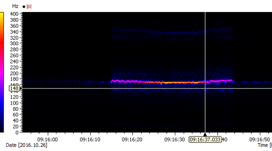
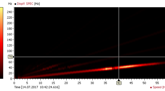
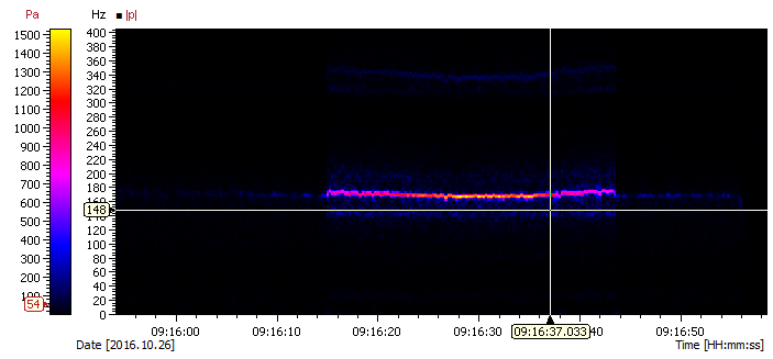
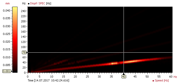
Spectrogram Plot
Analyze frequency phenomena over time with a spectrogram. Display amplitude changes for all frequency lines at once.
In the example the absolute spectrum of a pressure sensor installed in an acoustically excited burner is displayed. You can see how the amplitude of the first harmonic at a frequency of ≈175Hz and increases and decreases over time.
On the x-axis the time is displayed, on the y-axes the spectrum unit, e.g. frequency [Hz]. The color bar on the left defines the colors depicting the magnitude of the spectrum values.
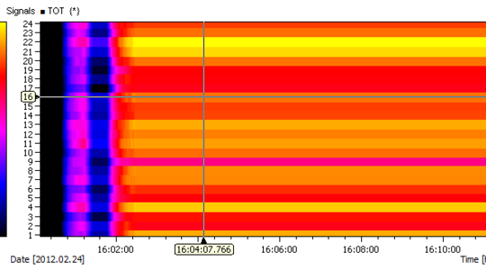
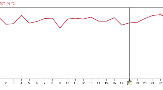
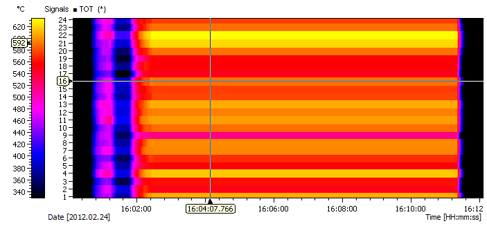
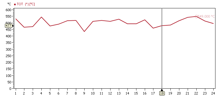
Intensity Plot
Display a group of signals with the same unit in one intensity plot. You get an overview of the values over time. Thus, you can quickly identify sensor values which deviate from the rest of the group and analyze how values change over time. The plot gives a quick condensed overview over a group of signals which is superior in comparison to a trend plot.
In the example, 24 turbine outlet temperatures are drawn on the y-axis over the x-axis (time). The temperature is drawn by color, where the color corresponds to a value displayed on the "color bar" on the left side of the plot.
Plots Visualizing the Values of a Signal at the Position of the Time Cursor
Looking at the change of a signal over time is one of the most fundamental analyses. IFTA TrendViewer provides two time cursors to analyze the exact value of a signal at a time.
The following plots show the value of signals to the time cursor:
- List plot
- Led plot
- Spectrum/Array plot
- Radar plot
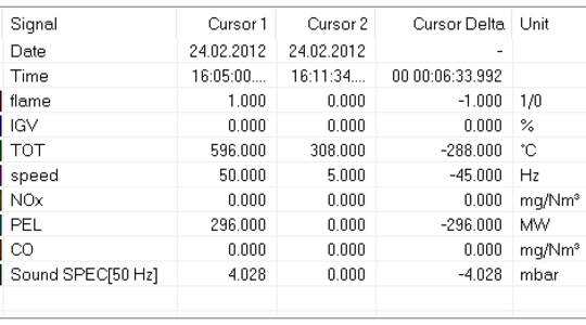
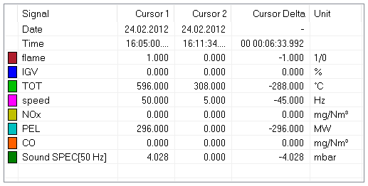
List Plot
Display the values of signals at the current time cursor positions. Thus, you can quickly compare values of different signals and different times.
In the example, the current values of machine state variables are shown for time cursor 1 and 2. Additional data is the time, the value difference between the two cursors and the signal unit. It is possible to configure the number of tables, visible columns and rows.
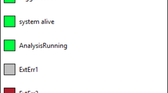
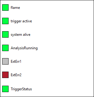
LED Plot
The LED Plot displays states (boolean/logical signals) at the current time cursor position. See immediately if an error or alarm occurs and if your system is running correctly.
The example shows several binary signals (green/red for true and grey for false). A color can be chosen for the active and inactive state.
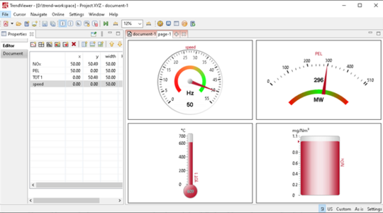
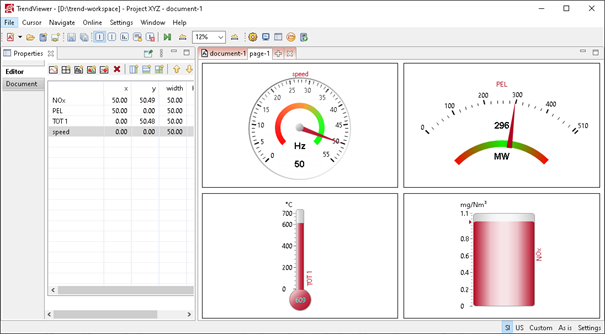
Widget Plot
Use the Widget plot to present speed, temperatures or pressure data in an appealing and clear way.
You can create this plot by dragging and dropping signals into an empty plot area. We offer four different widgets: speed gauge, thermometer, tank and meter. Multiple signals can be displayed at the same time, e.g. multiple temperature signals. Additionally, you can configure thresholds for warning and alarms, which are then also visualized.
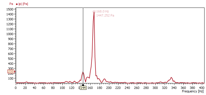
Spectrum Plot
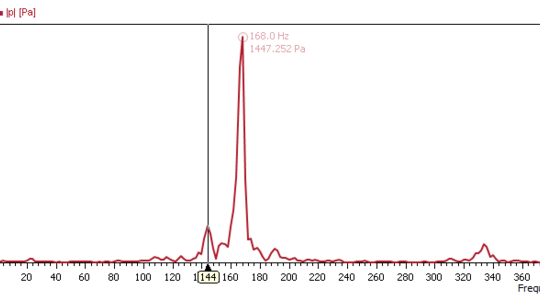
Use the spectrum plot to analyze spectra for a selected point in time. Read the amplitude for all frequency lines at once and identify relevant frequencies at current time cursor position.
The figure shows the absolute spectrum of a pressure sensor installed in an acoustically excited burner. The resonance peak at 168 Hz is automatically marked with a label depicting the magnitude and frequency.
The plot is often used in conjunction with an intensity plot to display the values at the current cursor point. On the x-axis, the frequency is displayed and on the y-axis the magnitude of the spectrum.
Array Plot
Display a group of signals with the same unit in one plot. You get an overview of the values at the current time cursor position. Thus, you can quickly identify sensor values which deviate from the rest of the group.
In the example figure you can see 24 turbine outlet temperatures. On the x-axis, the sensor number is displayed and on the y-axis the temperature.
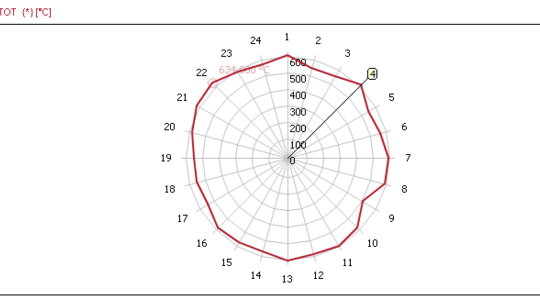
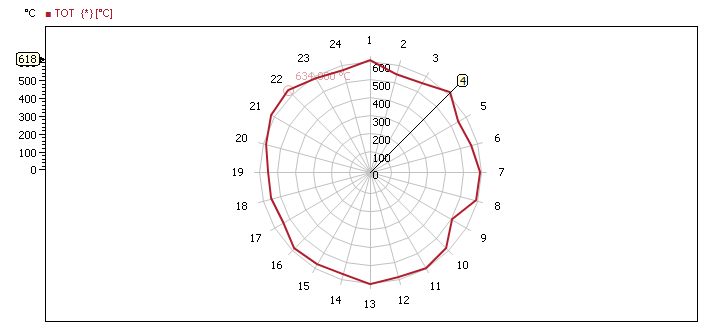
Radar Plot
Use the Radar plot to gain a quick overview over multiple signals at once. You can easily see if one sensor provides different data than other sensors for a larger number of measurement signals.
In the example you can see 24 turbine outlet temperatures drawn equidistantly around the plot origin.
Plots with an implicit time axis
If the change of a signal is not observed over time, but over another signal, then plots are used which have an implicit (not visible in the plot) time axis. This determines the time period of the values to be displayed.
The following plots have an implicit time axis:
- Bode plot
- Polar plot
- Orbit plot
- Shaft Centerline plot
- Campbell / Intensity map plot
- XY plot
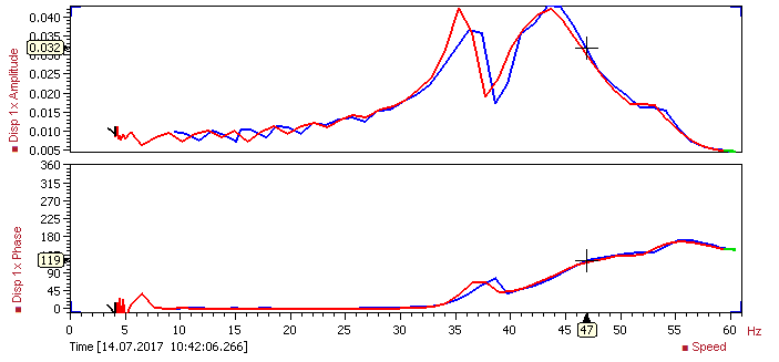
Bode Plot
Use the Bode plot to analyze machine runs. Display frequency responses or harmonic modes versus the rotational speed. You will be able to identify critical speeds and resonances. Evaluate angles and magnitudes of unbalances by analyzing speed, amplitudes and phases, calculated in reference to a keyphasor signal. By using machine state coloring you get a quick overview over a complete run.
In the example figure you can see amplitude and phase of the first harmonic mode of a distance sensor displayed over the rotational speed in [Hz]. The line color depends on the machine state (Here: black: slow roll, blue: run up, green: steady state, red: run down).
In addition to rotor dynamics analysis you can display any combination of three signals in the Bode plot. Use it to group and display two time signals over a common third signal.
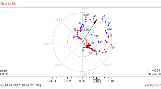
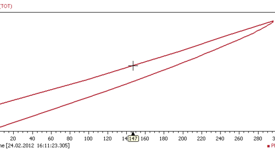
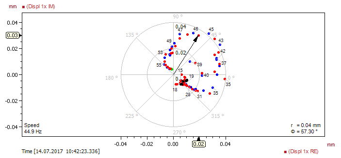
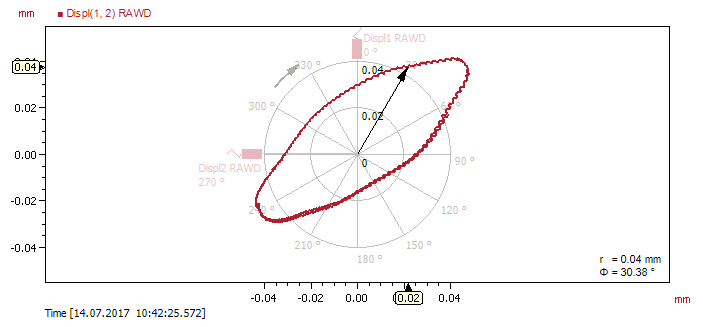
Polar Plot
Identify resonances or critical speeds and display harmonic modes with the Polar plot. Evaluate angles and magnitudes of unbalances by analyzing speed, amplitudes and phases, calculated in reference to a keyphasor signal. By using machine state coloring you get a quick overview over a complete run.
The example shows the first harmonic mode of a distance sensor, which measures the distance to a rotating shaft. The imaginary values are plotted against the real values while the resulting points are labeled depending on corresponding engine speed values.
The point color depends on the machine state (here: black: slow roll, blue: run up, green: steady state, red: run down). The complex phase (Φ) and amplitude (r) at the current cursor value are written in the lower right corner. The current cursor time is displayed in the lower left corner.
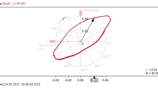
Orbit Plot
Investigate shaft vibrations and unbalances with orbit plots. Visualize the momentary shaft displacement with respect to a stationary bearing and evaluate the excursion of the shaft.
The example shows the orbit of a rotorkit shaft derived from two orthogonal displacement sensors.
The values of magnitude and angle at the current cursor position are shown in the lower right corner. The plot draws two sensor positions corresponding to the x and y signal. Additionally, the rotation direction is shown in the plot by an arrow.
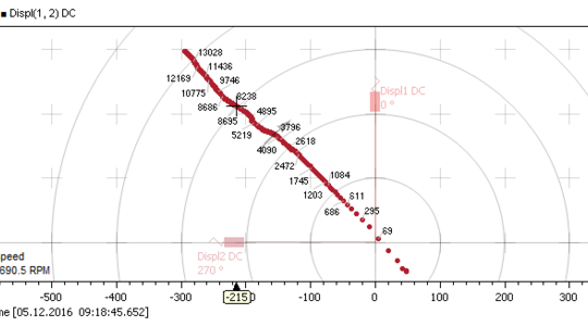
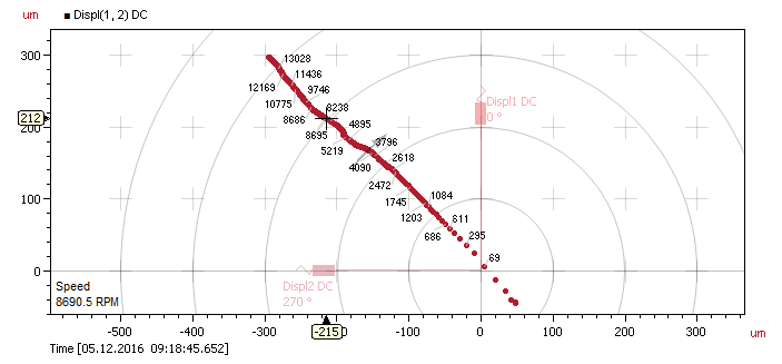
Shaft Centerline Plot
Monitor stationary movement of shafts with respect to stationary bearings with shaft centerline plots. Rotor dynamic experts use this plot to analyze the displacement of turbine or compressor shafts mounted in hydraulic bearings, as the shafts start to float upwards due to the rotational movement.
In the example you can see the movement of a compressor shaft from the lower right corner to the upper left corner.
DC values from displacement signals are displayed on the x- and y-axis respectively. A speed signal can be used for labeling the data points.
Campbell Plot
Draw a spectrum data source in relation to a speed signal with the Campbell plot. Quickly identify speed dependent phenomena and analyze harmonic mode changes.
The example shows the amplitude spectrum of a shaft displacement sensor over the speed signal of a rotor kit. The first four harmonic modes and how they change in magnitude can be seen in the plot (red/yellow lines).
On the x-axis, the speed is displayed, the y-axis shows frequency in Hz. The magnitude of the spectrum can be depicted on the ‘color bar’ at the left side of the plot. Additionally, the current time and range are displayed in the lower left corner.
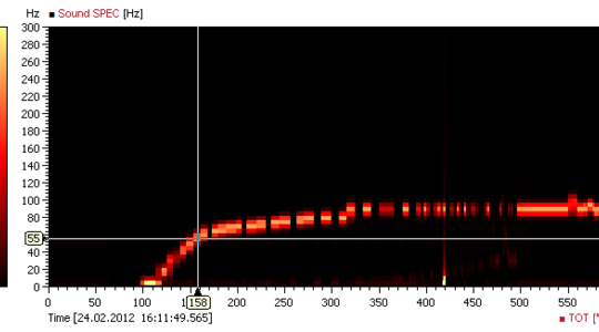
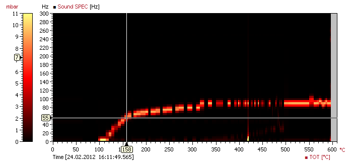
Intensity Map Plot
Analyze how amplitudes and frequencies change depending on values of numeric signals with the intensity-map.
In the example, the absolute values of a sound spectrum in dependence of the mean turbine outlet temperature is shown. On the x-axis, the numeric signal, the temperature, is displayed, the y-axis shows the frequency in Hz. The color bar on the left defines the colors depicting the magnitude of the spectrum values.
The intensity-map plots a spectrum data source over a selectable signal. Additionally, the time is displayed in the lower left corner of the plot.
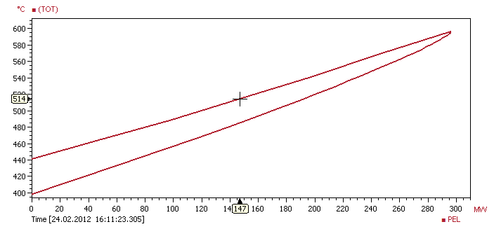
XY Plot
Visualize signal dependencies with the XY-plot, by correlating signals directly.
In the example, the mean turbine outlet temperature is plotted on the y-axis against the electric power. The current time position is shown in the lower left corner of the plot.
The XY plot is used to plot multiple data sources with a shared time region, whereby one data source is plotted on the x-axis and all additional data sources are plotted on the y-axis.